Ally

View prototype
TIMELINE
Summer 2022
PROJECT LENGTH
80 hours
ROLE
Product Designer
METHODS
User Research, User Flows, Wireframing, Brand Design, Prototyping, Usability Testing
OVERVIEW
Ally is a friendship matchmaking mobile application that seeks to foster authentic connections with integrated an hangout setup. The goal of this project was to discover a new way for people (specifically adults) to find new friends. The product hopes to achieve the same sense of familiarity that dating apps serve. Think of your favorite dating app, but only for making friends!

A common hurdle as we mature across adulthood is the struggle to make new friends, along with other obstacles that make it difficult to uphold a social life. Overcoming shyness, being preoccupied with life, and breaking comfort zones can set us back from putting ourselves out there, and meeting new people. Ally's goal is to introduce another way for users to meet new people that works to minimize the obstacles that come with that.

PROJECT CONTEXT

Background

Social connection is an innate human desire!

Research equates its importance to that of basic needs like food and shelter.

Problem

Life's nuances make it hard to make friends

A 2019 study found nearly half of American adults struggle to make friends due to life's setbacks.

How can we design a product that encourages users to expand their social circle, despite these setbacks?

Solution

Ally introduces more opportunities for users to make new friends with alike interests, designed for users to build connections based on similarities.

Ally also offers Hangouts, where users can ask each other to hang out based on events in their area! Users can choose to favorite Hangouts they're interested in, and ask their new friends if they'd like to join them to those events, all directly through the app.

RESEARCH

ANALYZING THE MARKET

While there is a market for friendship-building apps, there aren’t many that promote building lasting and meaningful friendships. Apps like Hoop, Wizz, and Wink are all built with the purpose of making friends, but are designed with the intent of combatting loneliness rather than building meaningful connections.

Although these products don't align with the ideals of Ally, they can still provide helpful insight to the mechanisms and features that users already understand. And for some of these apps, they can show some features wouldn't necessarily suit Ally.

USER RESEARCH

I conducted interviews on users ages 23-32 with 4 identifying female and 1 male, to understand the role of friendship in user lives. Examining common stressors and drawing points amongst users, I was able to dive deeper in my understanding of building connections for users, leading to a few key insights:

A way to meet new people authentically

90% of participants claim their only way of meeting new people is through mutual friends, and struggle to meet them independently.

Large gap between IRL and online friends

Nearly all users were open to meeting new people online, but there were clear distinctions between their online and real life friends.

Breaking surface-level friendships

Many participants claimed there needed to be some point of similar interest with the other in order to consider being friends with them.

Simple, easy entryway to initiating

The task of asking people to hangout can come with many obstacles. Many users claimed life was often too busy or they were to shy to ask!
Survey Data

I conducted interviews on users ages 23-32 with 4 identifying female and 1 male. My goal was to understand the role of friendship in user lives. I wanted to learn more about what prevents them from making more friends, and what they look for in a friend.

67%  recall feelings of loneliness

68%  want to expand their social circle

77%  value compatibility over proximity

65%  prefer to know about a person before meeting them

94%  are willing to make friends online

INFORMATION ARCHITECTURE

ROADMAP

I created a product roadmap consisting of all the features I wanted for the product, including a description for each feature and research that supported it. When creating an end-to-end product, I believe this part of the process cannot be overlooked.
Creating a roadmap was essentially creating a blueprint of features and defined prioritization for features. Given the time constraint of this project, it was absolutely necessary in laying out what needed my attention.

PRODUCT NAVIGATION

At this point, I designed a sitemap that displayed each tab of the mobile app, with their features and actions. This step was crucial in assessing how cohesive the product was by visually seeing the different access points of the features, and how they worked together to create one whole product.

USER FLOW

For me, mapping out a user flow typically finalizes the skeleton of the product. Once I was able to visualize the path a user takes with a goal in mind, I am able to account for what the product should provide across every possible scenario.

DESIGN

WIREFRAMES

Because of time restraints, I could not afford to make mid or high fidelity wireframes, as I was planning on holding 2 rounds of usability testing. My goal with creating these wireframes was to design a very generalized skeleton of the product, one that was okay to be tested with participants.

Wireframe Testing

I conducted a usability test on the low-fidelity wireframes to determine if the app's navigation and structure was usable. The usability test included testing 3 different flows: profile setup, setting up a hangout, and browsing activities. I received a lot of feedback from the first round, and implemented most of them. The full test findings can be found here, but I highlighted a few changes:

MOODBOARD

I drafted a quick moodboard to get an idea of the direction I wanted to go in for this project. I wanted to go for something that was fun and vibrant, and these images were exactly what I was going for. I was able to take in inspiration from these images, and from here I felt ready to start with branding for Ally.

BRAND DESIGN

Wordmap

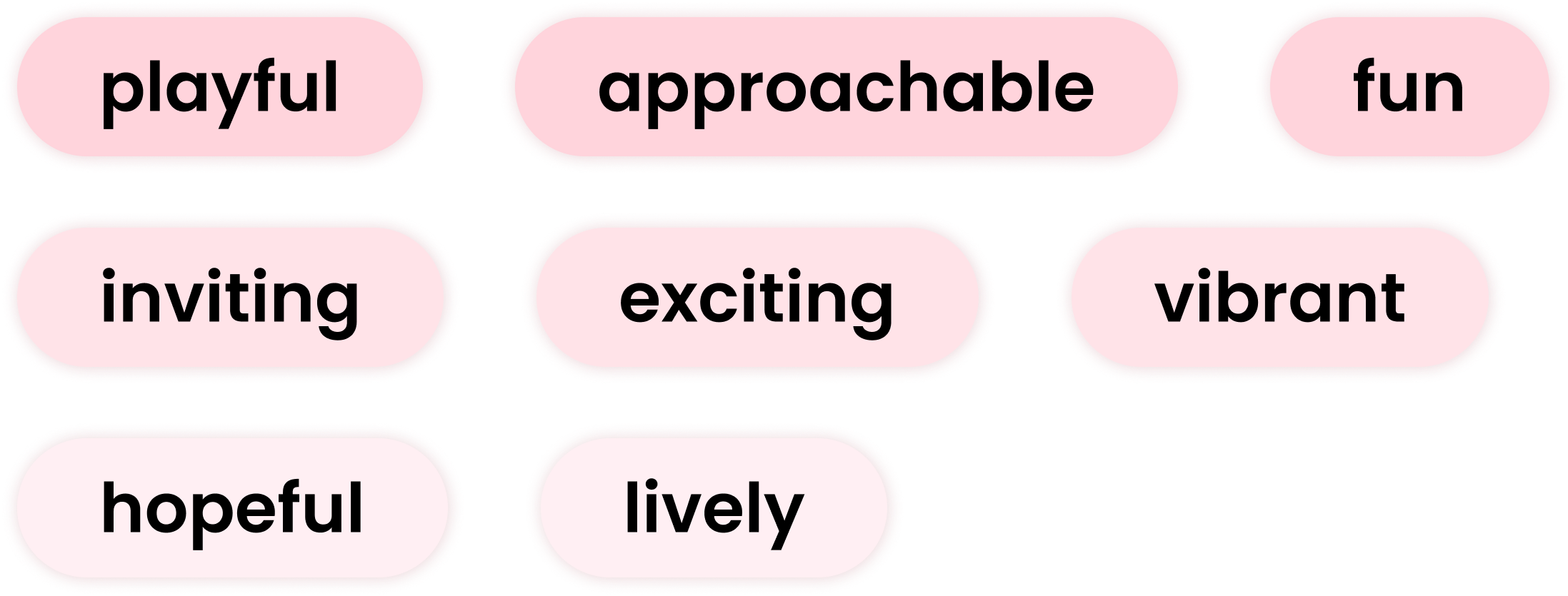
After creating the moodboard, I wanted to hone in on specific feelings, emotions, and responses it would elicit from users. To help with this, I solidified a clear set of words that encompassed Ally.
Color Palette

The next step was matching a color palette to these words. What colors was I envisioning that matched these feelings as accurate as possible? I went with shades of pink to elicit playfulness and vibrancy, and as a secondary color, soft shades of yellow to bring out notes of friendship and approachability.
Typography

From ideation, I knew Ally would use some kind of Sans Serif font for its typography. Sans Serif fonts definitely give off more of the clean and casual aura I wanted Ally to have, so I made sure to pick fonts that were bubbly and fun.
Logo

When creating the logo, I really wanted to stay true to the idea of friendship, and not lean too much towards romanticism. Although pink is the primary color for the product, I went with yellow in the logo to clarify the purpose behind the project: to promote connections. I paired the text with a simple handshake logo to keep it casual and portray peaceful intentions.
Buttons

Ally's set of buttons utilizes the primary and secondary colors, with all capitalized text. I included a look of the inactive states, as well as the filter buttons.

ITERATIONS

Testing Final Designs

I held another round of usability testing on the first version of the product designs, which implemented revisions from the wireframe testing. Due to the time constraint, I decided to gather the results into a priority matrix to decide what changes were absolutely necessary, and what could have been sacrificed.

PRIORITY REVISIONS

Improve Onboarding
Many participants felt that the idea of Hangouts was confusing to them, and needed further explanation. In the first iteration, I had only included onboarding screens at account creation. In the revision, I included onboarding screens for each tab for further clarification.
Adding Buttons to Swiping
In the first version, the idea was to integrate the "swipe" mechanism where swiping left would remove the user from the pool, and swiping right would send the user a like. When implementing this version, I initially created it without any buttons and only swiping. In the second iteration, I added a panel for buttons in addition to swiping, to give users clarity when using the app. In the profile preview, users can swipe through other users' images, and tap on their card to view their entire profile.
Changing Matches to Friends
I struggled to dissociate Ally from dating apps. I felt the term "Matches" was leaning Ally in that direction, so I changed Matches to Friends in an effort to prevent those associations.

Combining Friends and Messages
I reduced the number of tabs from 5 to 4 to simplify the overall design and navigation. From examining competitor products, it was common to find these in the same place, so I wanted to provide the same familiarity. The initial design for Matches was also not suitable for scale. Loading multiple, possibly even hundreds of users, would be impractical for that kind of design.

Final Product

view prototype

Profile Setup

I designed an extensive profile setup, where users can input select information that allows them to display their authentic selves. Users can customize their profiles to show how they identify, their hobbies/interests, and fun prompts to show off their personalities.

Waving

Inspired by the swipe method, waving at a user lets them know you want to be friends with them! If the users waves back, you become Friends. Friends can directly message each other, or set up a Hangout to meet in real life.

Hangouts

According to my research, 94% of users were comfortable with making friends online, but most of the users didn’t consider friends they made online to be real friends until they had met in person. The idea of Hangouts is to bridge the gap between online friends, and IRL friends.

Users can browse Hangouts by category and add them to their profiles. By adding a Hangout to your profile, Friends can set up a Hangout with you to meet in person directly through the app!

Custom Hangouts

I designed an extensive profile setup, where users can input select information that allows them to display their authentic selves. Users can customize their profiles to show how they identify, their hobbies/interests, and fun prompts to show off their personalities.

MOVING FORWARD

TAKEAWAYS

Design embodies individuality

Designing for personalization allows for individuality to shine. Understanding the differences in our identities was key in making sure that users not only felt included, but were also given the freedom to let themselves be seen for who they are.

UX Design ≠ one-size-fits-all

Because of the nature of creating single sets of design, it only feels right to think of UX Design with a one-site-fits-all approach. But this can be a limiting mindset, because the needs of users are vastly different. Our jobs as designers are to create user-centered design, design that seeks to understand the diversity across users and adhere to those differences.

Consider Scalability

Since I've yet to work on a live project with real users, I was unaware of designing for scalability, and it was not something I took into consideration with this project. However, I understand scalability shouldn't be ignored, and is a vital consideration when designing a product for many users!

CHALLENGES

Dissociating from a dating app

I struggled heavily with dissociating Ally from a dating app, mainly because I felt my main reference points were actually dating apps. In the future, I would reconsider reinventing the product with this consideration in mind.

Prioritizing Onboarding

In designing the app, I overlooked the importance of onboarding and severely neglected it. It wasn't until the testing phases that I realized how crucial it was as part of a product, especially when introducing new ideas.

Differentiating online & IRL relationships

My research did not go into this enough, and I feel the product suffered from it. The reality is that it takes a lot to meet someone you meet online. Further understanding the differences would allow a better perspective of designing for a product that works to solve bridging the gap between the two.

FUTURE STEPS

Consider a different approach to branding

In hindsight, I think there's a lot of room for improvement regarding the product name, color palette, and overall branding. I think the way it is designed right now doesn't portray the original idea I had in mind for the product, as it leans too much towards dating rather than friendship.

Explore other ways of integrating Hangouts

I think there could be a more seamless approach to the idea of Hangouts and introducing it to users. In reality, It's not easy to meet someone online and decide to meet with them the next day. I think additional features can be added to build that trust/friendship before having them meet in person.
01. CONTEXT02. RESEARCH03. SYNTHESIS04. DESIGN05. FINAL

thanks for stopping by!

© 2024 Ryanne Sim